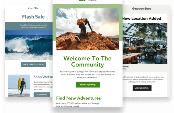
We spend a lot of time checking out emails here in the Campaign Monitor creative department. Whether we’re obsessing over new email technologies, lusting over good-looking design or infatuated by well-written copy, we occasionally play favorites.
In this post, we’ll look at nine emails selected by members of our Creative team.
American Eagle
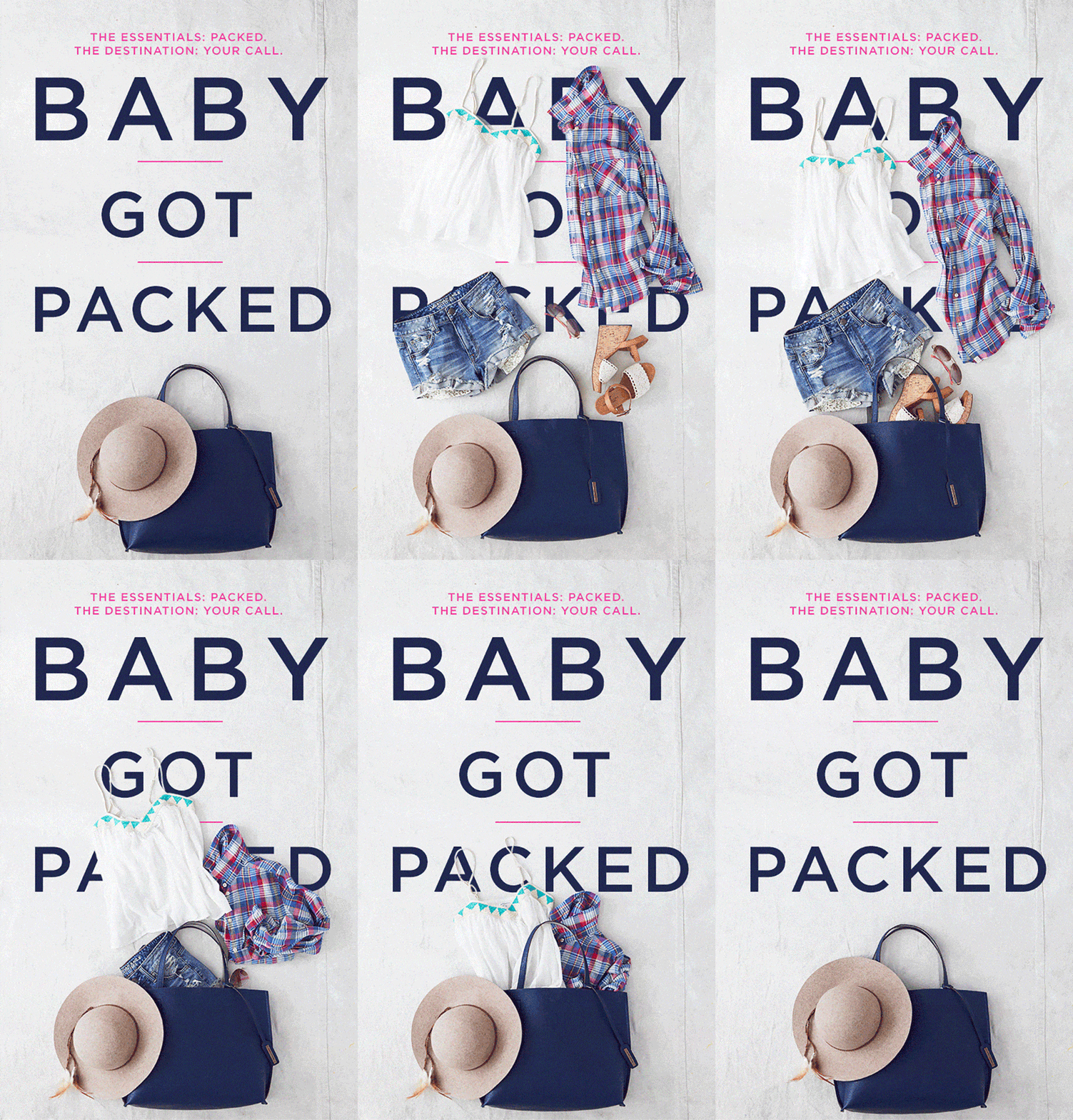
This email plays off Sir Mix-A-Lot’s famous pop song “Baby Got Back.” American Eagle created a fun GIF in which clothes move down the email and eventually reveal the clever headline: “Baby Got Packed.”
*Mind-blown* It’s so awesome and fun. Kudos to American Eagle for having such creative emails.
– Kate Reyes, Art Director
Lagunitas
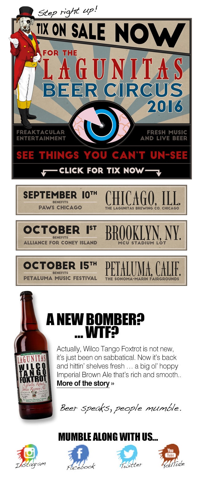

Lagunitas is a company that knows its brand and its target. Right at the top of the email, they let you know what the email is about and they do it with a sense of urgency: “Tickets on sale now” for their famous Beer Circus and a complete listing of easy to click on locations.
The email is full of big, beautiful, and fun images, plus there’s a lot for the reader to discover and enjoy. The voice and tone of the email is totally on brand with copy like, “See things you can’t unsee!” and “A new bomber? WTF?” to promote their Whiskey Tango Foxtrot beer. They include video enabling readers to see their amazing beer canning line in action—again Lagunitas knows their audience! And at the end, they provide some social ways to “mumble along” and stay in the know. After all, their brand motto is Beer Speaks. People Mumble.
– Jimmy Cabral, Creative Director
The Trunk Club
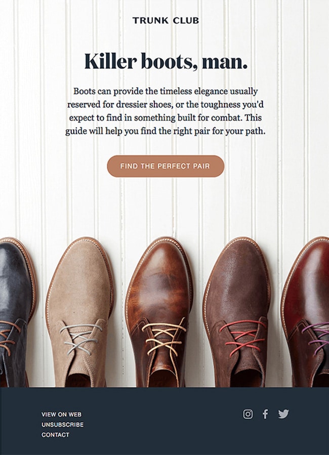
I love this email from Trunk Club because it’s simple and beautiful. It’s a combination of smarts and style.
It can be difficult to create a retail email that is also upscale.Trunk Club showcased one product, with many options, while giving a nod to the fact they have a great selection. Additionally, they used a nice witty headline and pulled this tone through the rest of their copy. Nicely done, Trunk Club, And not an exclamation point in sight.
– Anne Lewis, Senior Copywriter
Rifle Paper Co.
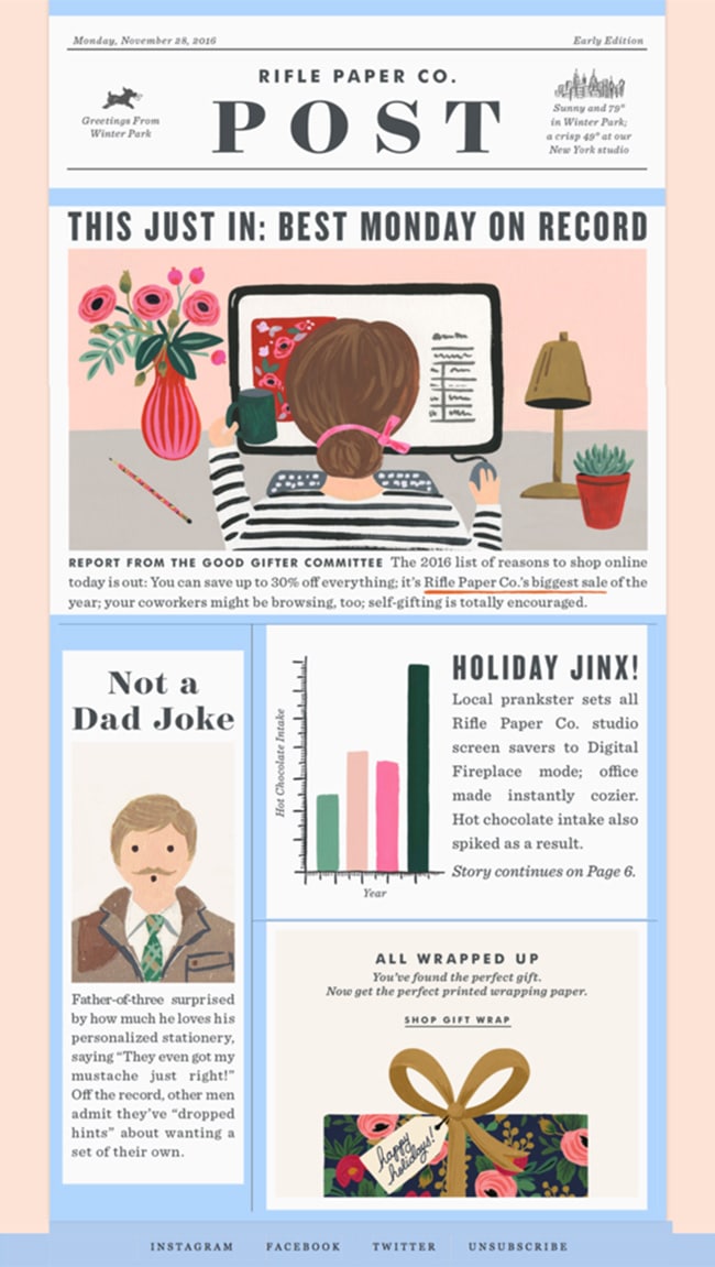
I’m a long-time fan of Rifle Paper hand-drawn stationeries by Anna Bond. Many people have tried to imitate her styles, but once you’ve seen her work before, you can always tell and recognize it among the other look-alike stationaries on the shelves. Her beautiful and whimsical illustration style really sets the tone for every product she puts out.
I always feel excited to check out Rifle Paper’s email newsletter, and I’m always in awe of the design choices they make for different types of campaigns. There are so many beautiful emails they sent out it’s hard to pick just one, but the one that sticks out in my mind is last year’s Cyber Monday newsletter.
Rifle Paper uses a simple, casual, yet catchy subject line (Good thing you saw this) in this newsletter, that makes you curious to open it. It’s vague but leaves you wondering what’s inside. Damn Rifle Paper. (Looking at their catalog now…)
– Novita Prasetia, Designer
Two Associates
A simple and elegant way to send warm wishes for the holiday season. More importantly, it displays Two’s unique talents: amazing creative, as well as innovative thinking by harnessing their customer’s quiet time during the holiday, inviting them to interact with the email and post their creation on Twitter. So fun.
– Dustin Finkle, Marketing Project Director
FontShop

I’m a huge fan of the emails FontShop creates and sends.They are one of the world’s largest typeface resellers, consistently creating flawlessly designed emails that support their products and their mission.
Big beautiful full-width images, perfectly crafted typography, excellent use of white space, and small details like hover states all add to create a very contemporary and inviting email.
What stands out is how responsive they are. This allows the emails to work well on all screen sizes. By giving the user an option to view the email in the browser, it opens up a world of opportunity to show off their typefaces. This allows them to create a uniquely branded experience, in a world where email design is stuck at 600px wide, using web-safe typography, and are not responsive. They are blurring the lines between email design and website design which is super interesting.
Some may say their emails may lack support, but for their target audience (designers) I feel they are spot on. It’s also a brave and innovative way to look at email design. Nice work, FontShop.
– Mike Twigg, Senior Art Director
Pret

The out-of-the-box thinking in this email is what impresses me the most with its interactivity and how the fallback is so seamless. Viewing this email, for email clients that utilize the webkit vendor prefix and supports CSS3, readers get to interact with it as if it were a web page.
The interactivity uses default click functionality on labels to check a hidden radio button which, with clever use of CSS detecting when a button is selected, triggers a change of display of the appropriate container and begins a CSS animation rolling through an image to make it appear as though the cup is filling up with the flavor chosen.
This gives the email an extra dimension to what email normally provides a reader and allows the reader to engage more with the email.
For email clients that don’t support these things, a still image is provided which ensures this email displays correctly no matter what email client is used.
Smart, effective, and engaging – all things you want in a good email.
– Ash Durham, Lead Developer
Dollar Shave Club
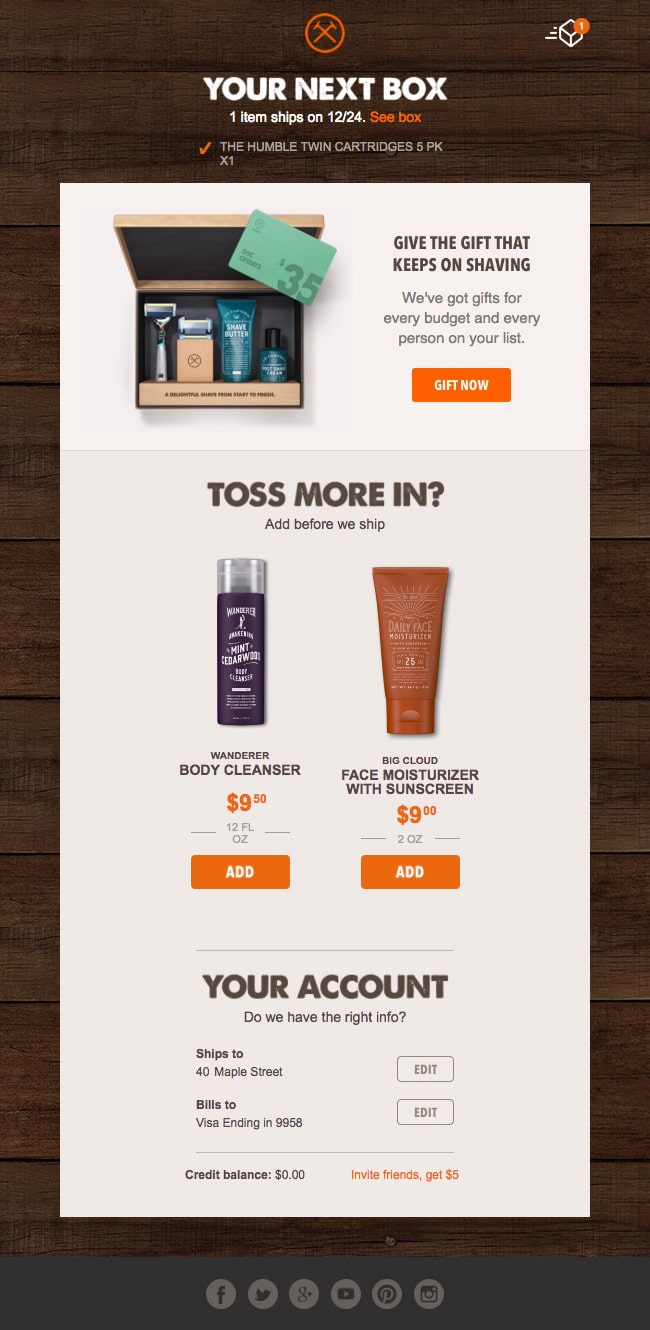
When it comes to email design, few are better than Dollar Shave Club. The design-led company has brilliant and humorous branding, amazing user experience, and aesthetic.
Dollar Shave Club puts their well-designed products first by contrasting them over clean white and gray backgrounds, centering the attention on the product alone. The short, bold headlines allow readers to see and digest the information quickly. The bright orange CTAs catch your eye and you can’t help but want to click, click, click.
Dollar Shave Club’s UX is keeping millennials like myself engaged and satisfied. Perhaps my favorite experience occurs once a month when I receive an email before my order is shipped. The email prompts me to add additional items before my order goes out. They’ve done an amazing job by including CTAs under each product prompting you to add to your existing order. The link automatically logs you in and the item is added to your order. There’s no confirmation. No, are you sure? No credit card. This is the type of painless UX that leads to impulse buying- tricky, Dollar Shave Club, but I like it.
– Dexter Gary, Designer
AIGA (American Institute of Graphic Arts)

Love this email by AIGA! It pushes the boundaries of what we expect from email. Reminiscent of a well-designed webpage, the interesting layout jam-packed with graphic shapes, unexpected colors and images make an impact in my inbox like nothing else.
Grabbing attention is one thing, but if you can’t keep it – you’ve lost momentum. Notice the unexpected logo animation? Surprise and delight keeps the viewer engaged. So too does the succinct and digestible copy. Adding text tags to each section makes the content easy to scan, and provides information without being overwhelming.
But the beauty of the email doesn’t stop there – everything is clickable. Images and headlines function as buttons, which means no fumbling around with clumsy fingers attempting to click small links or buttons. Nothing like a good-looking email that’s optimized for click-throughs. Nice work, AIGA.
– Nikola Keavy, Art Director
Wrap up
We hope you’re feeling inspired to jump in and create your own email masterpiece. For a head start check out the template gallery, designed by us. Or take a look at the best of the best, the Campaign Monitor top email picks in our Top 100 Emails Gallery.


