Article first published July 2014, updated February 2019.
It’s no secret that we love Basecamp, by the same team behind Highrise, Campfire, and other well-frequented apps. But as savvy as their services are, I personally tend to get just as excited about their email campaigns.
Think your campaigns need to lighten up a bit? After Basecamp switched to a new, mobile-friendly look and feel using Canvas, I thought we’d look at how they’ve balanced the brand’s business ethic with a healthy dose of fun. If this sounds like something you’re striving to achieve with your own campaigns, read on.
Putting it in plain English
How often do you get emails that use staid language and stale analogies when describing new features? Wouldn’t it be nice if more companies spoke to you like an ordinary person would?
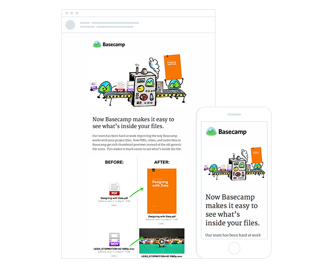
Basecamp has always done a great job at communicating with their customers. Instead of just saying “we’ve changed the icons in the app,” they adopted a friendlier approach in their email, announcing that “we’ve made it easy to see what’s in your files.”
Not only does the copy sound a lot more normal, but it describes an outcome and a purpose, instead of the simply stating what’s changed cosmetically in the app.
The illustrated campaign
It goes without saying that the simple illustrations throughout the email add a sense of whimsy without being there for simply whimsy’s sake. Created by Nate Otto, a Chicago-based illustrator, they’re a cool way to project Basecamp’s down-to-earth image while creatively reinforcing the email’s message.
You’ll notice the illustrations on the Basecamp site as well as on The Distance, their digital magazine covering longstanding businesses and the people behind them.
Made lovingly for mobile
Finally, this newsletter looks great on mobile screens – really great. Jamie Dihiansan at Basecamp (who we interviewed the other month) mentioned Canvas‘ mobile-friendliness, saying, “I wanted to design a campaign that would for sure look great on all devices.”

If you click on the screenshot above, you can see that they’ve achieved just that, through a one-column design that squeezes so much on to a small screen without losing the ample white space.
Are shorter subject lines better?
Interestingly enough, an A/B test was run on subject lines, being:
- New Feature: Preview PDFs, videos, and sound files
- New: Preview PDFs
While I personally thought the “New Feature” subject line would be the clear winner, the ultra-short “New: Preview PDFs” version was much more popular, gaining 16.7% more opens.
More testing would be required to determine whether the shortness of the subject line was an influencing factor or if the word “feature” was potentially a turnoff. In the interim, we’d love to know what you think!
What can you learn from Basecamp
Basecamp consistently sends engaging and memorable email newsletter campaigns that just have to be put under the microscope. You can definitely learn a lot from them. From how to design an email newsletter to the kind of content it should contain and much more, Basecamp has set a good example to follow.
Here are a few tips you can glean from their latest email newsletter:
Focus on how you can improve your customers’ lives
With email inboxes becoming cluttered, it’s harder for businesses to get their email newsletters opened. To get around this, take a cue from Basecamp and provide value. That’s why experts advise that your newsletter should be 90% informational and a mere 10% promotional.
People can’t resist anything that adds value to them. That is why your email newsletter must be value-packed.
Mentioning that something’s changed in-app is one thing, but then saying, “We hope this update makes finding, sharing, and managing files in Basecamp a little easier” is so much more persuasive.
Take a cue from Basecamp: Put the emphasis on the goal, not the change.
Source: Really Good Emails
Notice in the above newsletter that although Basecamp is talking about what they do, they flip it by talking about what it does for their subscribers. In short, it’s not about Basecamp, it’s all about you.
The reason your subscribers signed up for your product or service in the first place is that they saw it as a means of solving a particular problem in their lives. And they expect you to continue being a help through your email newsletter, not a pain.
So focus on how you can help improve your customers’ lives, and they, in turn, will be loyal customers.
Use images to support your message
Human beings are naturally visual creatures. That’s why images help convey your message clearer. Images also help your subscribers remember the message in the email. Basecamp’s email newsletters feature fun images that actually help readers understand and digest the content in the email.
However, include too many images and the email may not look appealing if the images take too long to load. That’s a sure recipe for disengaging your reader.
Another reason to use images strategically is that they can easily distract from your main message – especially if you use stock images.
Having said that, when used well, images can be used to increase the impact of your content. One way they can do that, apart from visual appeal, is as visual cues that lead the readers to specific areas of your email.
Used strategically, visuals increase the impact of your newsletter. Use images that convey what you are trying to say. Don’t just use images for the sake of using them. Use them to speak the thousand words you can’t fit in your email newsletter.
Look for images (or illustrations!) that either directly demonstrate what you’re trying to convey, or communicate your message in a clever way.
Be a friend
Basecamp’s email newsletter does a few things really well. One of them is to befriend their subscribers.
By maintaining a warm friendly tone instead of “salesy” language, Basecamp’s email newsletter becomes more of a trusted guide than a sales tool. The result is a newsletter your subscribers look forward to receiving. Particularly, if you use humor (that fits with your overall branding, of course) like Basecamp does, your email newsletters will be a breath of fresh air in your subscriber’s inbox.
This makes it easy for subscribers to engage with the brand, but it helps earn trust. And in the world of business, trust is money.
One tip you should learn from this is that your email newsletter must have a personality of its own, a friendly one. Avoid a dull, boring, and—most importantly—an overly promotional personality in your email newsletters.
Speak to your subscribers like friends. And like a friend, give guidance – don’t push your agenda. When you succeed in turning your subscribers into loyal friends, you won’t have any trouble converting them into loyal customers.
Consider the mobile experience
Mobile devices account for up to 77% of email opens.
Now that’s a stat you can’t ignore as you map out your email marketing strategy. In essence, this means you need to ensure your email newsletter utilizes a mobile responsive template.
In this multi-device generation, your email newsletter will quickly find itself deleted if you don’t accommodate your users. So whatever you do, go mobile. Like Basecamp, you can build mobile-friendliness into your email design workflow, either by studying up on responsive techniques, or simply by using a tried-and-tested email builder like Canvas.
It will guarantee that your well-designed, value-packed email newsletter succeeds in its mission.
Wrap up
A big thanks to Jamie and the Basecamp team for sharing their newsletter with us. In fact, they have nailed their email newsletter marketing strategy. This has led to high engagement and a healthy subscriber base for them. Both factors are critical to the success of any business today.
Do you know of a newsletter that makes great use of the techniques above to share significant news without being way too serious? We’d love for you to share your examples in the comments below.


